
截圖
Screenshot 元件會渲染具主題感知能力的圖片,當使用者切換網站主題時,能自動在淺色與深色變體之間切換。每當您需要展示應符合讀者目前色彩配置的 UI 截圖時,請使用此元件。
Props 參考
Section titled “Props 參考”| Prop | 類型 | 必填 | 說明 |
|---|---|---|---|
light | string | 否 | 淺色模式圖片的路徑 |
dark | string | 否 | 深色模式圖片的路徑 |
alt | string | 是 | 供無障礙功能使用的替代文字 |
width | number | 否 | 圖片寬度(像素) |
height | number | 否 | 圖片高度(像素) |
雙模式(淺色 + 深色)
Section titled “雙模式(淺色 + 深色)”同時提供 light 與 dark props,即可為每種主題顯示對應的變體。
切換右上角的主題選擇器,即可看到圖片切換效果。
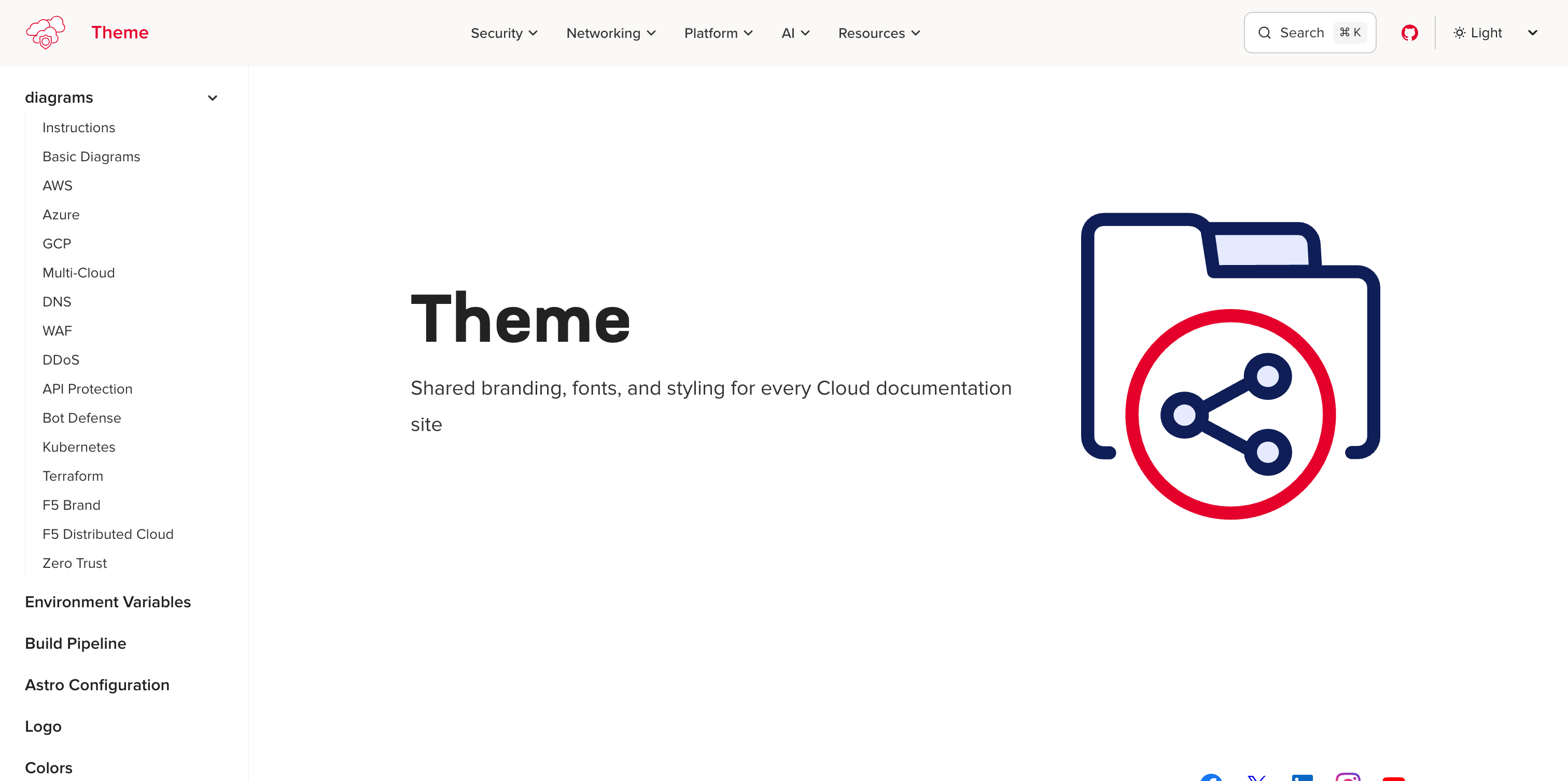
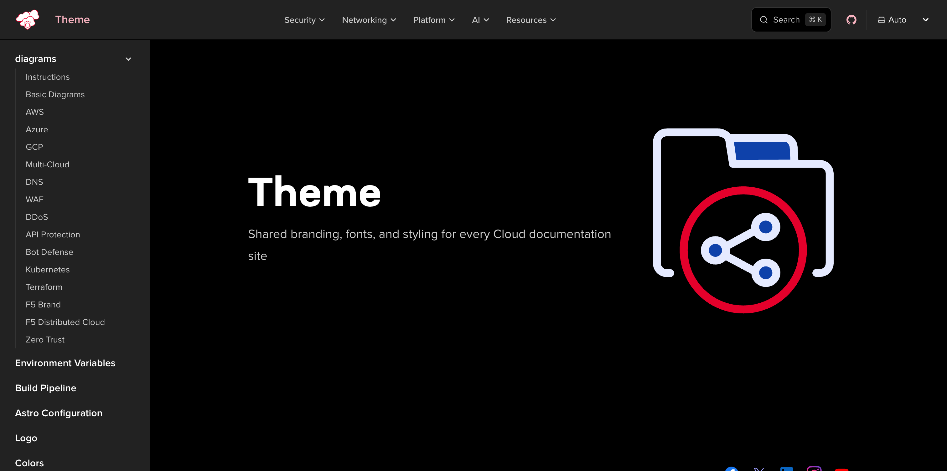
import Screenshot from '@f5-sales-demo/docs-theme/components/Screenshot.astro';
<Screenshot light="/images/screenshot-example-light.png" dark="/images/screenshot-example-dark.png" alt="Docs theme homepage"/>當只有一種變體可用時,僅傳入 light 或 dark 其中一項即可。
圖片將在兩種主題下均以相同方式渲染,不會進行切換。
<Screenshot dark="/images/screenshot-example-dark.png" alt="Docs theme homepage (dark only)"/>使用 width 與 height 來控制渲染大小並防止版面偏移。
<Screenshot light="/images/screenshot-example-light.png" dark="/images/screenshot-example-dark.png" alt="Docs theme homepage at fixed width" width={600} height={338}/>此元件會在 .screenshot-pair 包裝元素內渲染一或兩個 <img> 元素。CSS 規則根據目前啟用的主題切換可見性:
- 深色模式(預設)—
.screenshot-light圖片透過:root:not([data-theme="light"]) .screenshot-light \{ display: none \}隱藏 - 淺色模式 —
.screenshot-dark圖片透過:root[data-theme="light"] .screenshot-dark \{ display: none \}隱藏
額外的選擇器使用 :has() 處理 starlight-image-zoom 包裝元素,確保縮放功能能在兩種變體下正常運作。
所有截圖圖片均套用一致的樣式:細緻的邊框、圓角,以及懸停時會加深的投影效果。
與 Markdown 圖片的比較
Section titled “與 Markdown 圖片的比較”| 功能 | Screenshot 元件 | Markdown  |
|---|---|---|
| 主題感知切換 | 是 | 否 |
| 樣式化邊框與陰影 | 自動套用 | 否 |
| 懸停陰影效果 | 是 | 否 |
| 縮放支援 | 可與圖片縮放外掛搭配使用 | 可與圖片縮放外掛搭配使用 |
| 替代文字 | alt prop | ![alt text]() |
當您擁有針對特定主題的圖片變體,或希望呈現具樣式的截圖外觀時,請使用 Screenshot 元件。若是內嵌圖形、示意圖,或在兩種主題下外觀相同的圖片,則使用標準 Markdown 圖片語法即可。